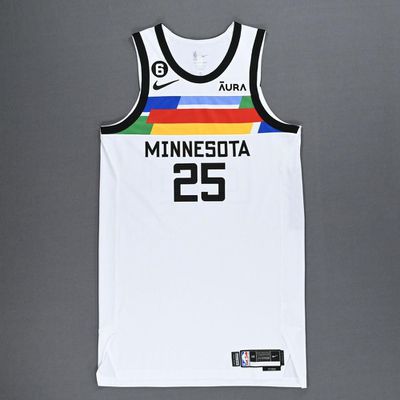
The Timberwolves’ 2024-25 City Edition jerseys have leaked. We take a moment to look back and rank all eight versions of the team’s City Edition styles.
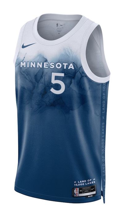
The Timberwolves’ 2024-25 City Edition jersey has been leaked, and… well, let’s just say I’m not exactly blown away. If you’re expecting something bold or groundbreaking, temper those expectations. This year’s design feels like a remix of last year’s “Lake” theme jersey—except instead of paying tribute to Minnesota’s lakes, we’re going with an “ice” motif. Cool idea in theory, but the result is more like a cold retread than a fresh look.
So, what’s the big difference? This time around, the jersey starts with dark, icy shades at the top and fades into white at the bottom—a flip of last year’s look, where the top half was white and the bottom was that lake-inspired blue. I guess you could say it’s the “Frozen” sequel no one asked for. While this is certainly not your typical Wolves uniform, it feels less like a bold new direction and more like they just inverted last year’s idea. It’s a little disappointing, especially since City Edition jerseys are supposed to be fun, unique, and, dare I say, adventurous.
That got me thinking: how do this year’s jerseys stack up to the rest of the Wolves’ City Edition history? Spoiler alert: not well. So, for fun, I ranked all of the Timberwolves’ City Edition jerseys since their debut in 2017. Let’s break it down, worst to best.
8. 2017-18 Edition
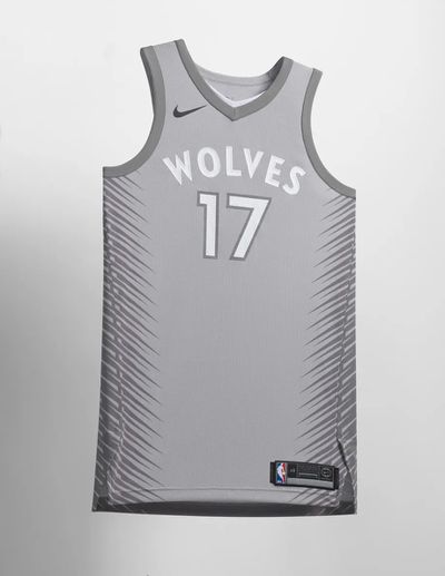
This first-ever City Edition jersey was about as exciting as a Tuesday in February. Gray with white accents, it was meant to honor the Twin Cities hosting Super Bowl LII and the rugged “Bold North” vibe. Unfortunately, all it really did was remind us how dull gray can be. It was supposed to symbolize the gray coat of a Timberwolf and the snowy North. Instead, it looked like a black-and-white TV show from the ‘50s. Zero flair, zero excitement—just a drab jersey that was more likely to put you to sleep than get you hyped for basketball.
7. 2024-25 Edition
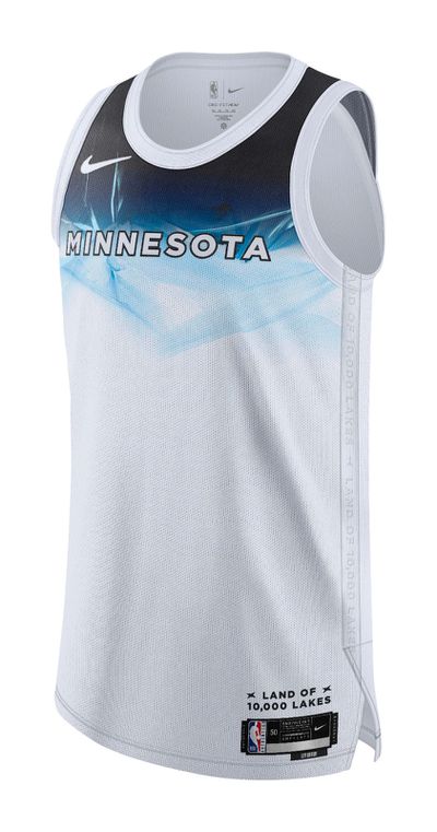
Here we are with this year’s jersey, and let’s just say, I’m not feeling the chills. Sure, it’s got the icy look, but when you’ve already done a lake theme that was actually pretty cool (pun intended), following it up with an ice version just feels lazy. The ice motif at the top doesn’t hit as well as the lake did last year. And yeah, we know it’s cold in Minnesota, you don’t need to remind us on the jerseys. Could the full jersey with the shorts look better when it’s officially released? Maybe. But right now, it feels like a step down.
6. 2020-21 Edition
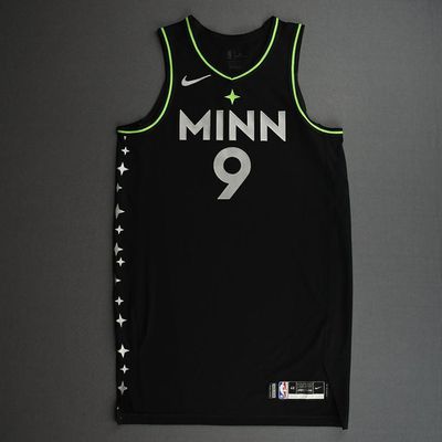
This one, dubbed the “North Star” jersey, leans heavily into the star motif. You’ve got a star at the chest, a constellation down the sides, and lime green accents that pop against a black base. Sounds cool, right? Except I never quite understood the whole star thing for the Wolves. Wolves howl at the moon, not stars, and the connection feels a bit forced. Plus, it’s hard to forget this jersey felt more like an homage to the old North Stars hockey team than anything directly related to the Timberwolves.
5. 2022-23 Edition
Now this one was out there—each player had their own unique pattern of colored block stripes across the chest. It was bold, it was colorful, and it was totally different from anything the Wolves had ever worn. Inspired by Minnesota’s art scene, this jersey took a risk, and while it might have been a little too “abstract” for some fans, I appreciate the swing. Plus, it achieved what a City Edition jersey should: standing out from the standard uniforms and showing off some local pride.
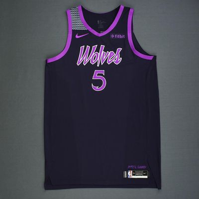
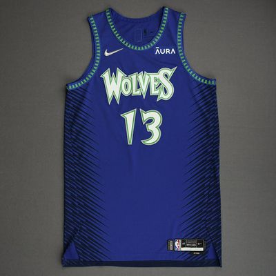
4. 2023-24 Edition
Paying homage to Minnesota’s famous lakes, this version featured a digital water pattern with a small “Minnesota” wordmark and white number on the chest. The lake theme was carried throughout, with the alternate Timberwolves logo showcasing a wolf howling against a watery background. Bonus points for the blue court they rolled out for the NBA Cup—this jersey just felt like a complete package that celebrated the state’s identity.
3. 2019-20 Edition

Light blue and white, this jersey honored both Minneapolis and St. Paul with an “MSP” wordmark across the chest. It was clean, it was classic, and it had that throwback vibe to the old Minneapolis Lakers. While it might have been a bit bland compared to other City Editions, it felt like a nice nod to the Twin Cities, and the light blue was a fresh color scheme for the Wolves.
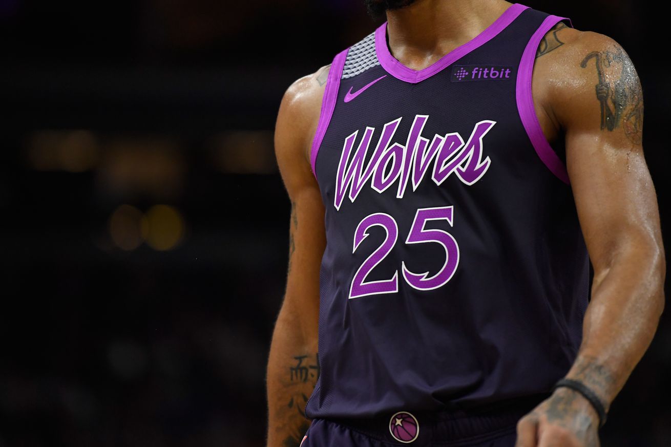
2. 2018-19 Edition
This one’s a fan favorite, and for good reason. Paying homage to Minnesota’s own music legend, Prince, this jersey was straight fire. The black base with purple accents was sleek, and the Wolves wordmark in Prince’s signature font was just perfect. It’s the kind of jersey that Wolves fans will be wearing for decades to come. If I didn’t have a soft spot for the next one on the list, this would easily be number one.
1. 2021-22 Edition
My personal favorite, hands down. This jersey was a love letter to every Wolves fan who’s been through it all—taking elements from various eras of Wolves history and combining them into one beautiful mash-up. The royal blue and green color scheme was a throwback to the original uniforms, the 90s font was back, and the classic tree lining along the neck and armholes just screamed nostalgia. This jersey was the ultimate tribute to the franchise’s history, and for me, it doesn’t get any better than that.
So there you have it—my completely subjective ranking of the Timberwolves’ City Edition jerseys. I know not everyone will agree (and that’s fine), but that’s what makes jersey debates so fun. Let me know where you stand in the comments.